
My first Data Analytics Project is about The vehicle sales for new and used vehicles for past few years, data source for this project is given in the last of project, tools used for this project are Power BI, Power Point, Chat GPT and MS Excel.
The vehicle sales report for the past Four years reveals a dynamic landscape in the automotive market. Observing the overall report, a surge in consumer demand for eco-friendly vehicles, coupled with favorable financing options, contributed to a notable increase in overall sales for new and used vehicles. This trend was particularly evident in the rising popularity of electric and hybrid models. Despite fluctuations, the overall sales trajectory remained resilient, showcasing the industry’s adaptability to evolving market forces over the two-year period.
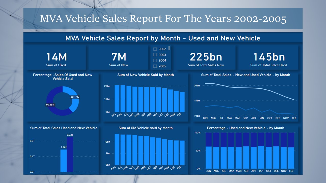
The donut chart
The donut chart depicting the percentage distribution between used and new vehicle sales provides a concise yet insightful overview of the market dynamics. In this visual representation, the chart elegantly displays the proportion of sales attributed to both used and new vehicles.
This visualization allows stakeholders to quickly grasp the market share of each category, offering valuable insights into consumer preferences. Whether it reveals a growing trend in the demand for new models or a sustained interest in used vehicles.
the donut chart serves as a visual compass, steering decision-makers toward a nuanced understanding of the market landscape.
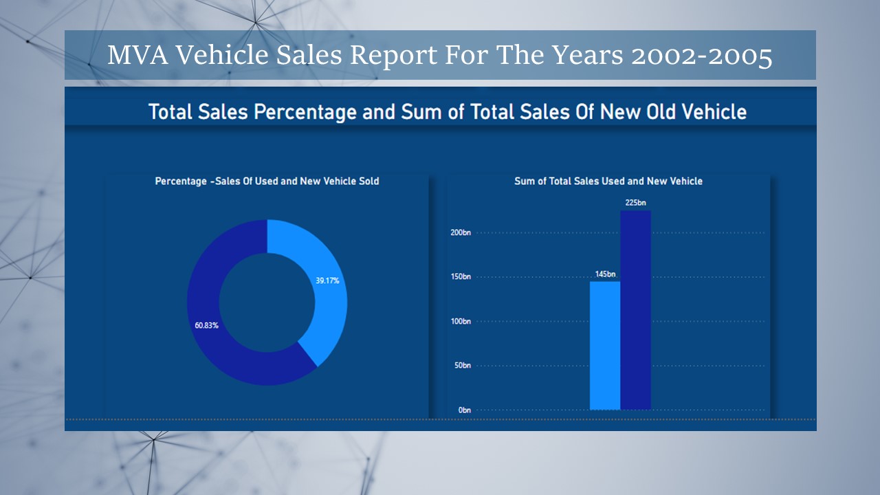
The bar chart
The bar chart depicting the sum of used and new vehicle sales provides a clear and tangible representation of the market’s total sales landscape. Each bar on the chart corresponds to the combined sales volume of both used and new vehicles, offering a straightforward comparison between the two categories.
This visual portrayal enables stakeholders to quickly identify which segment contributes more significantly to the overall sales figures. Whether the bars reveal a steady balance between used and new vehicle sales or showcase a pronounced dominance of one category over the other.
the bar chart serves as a powerful tool for decision-makers seeking to understand and respond to the dynamics of the automotive market.
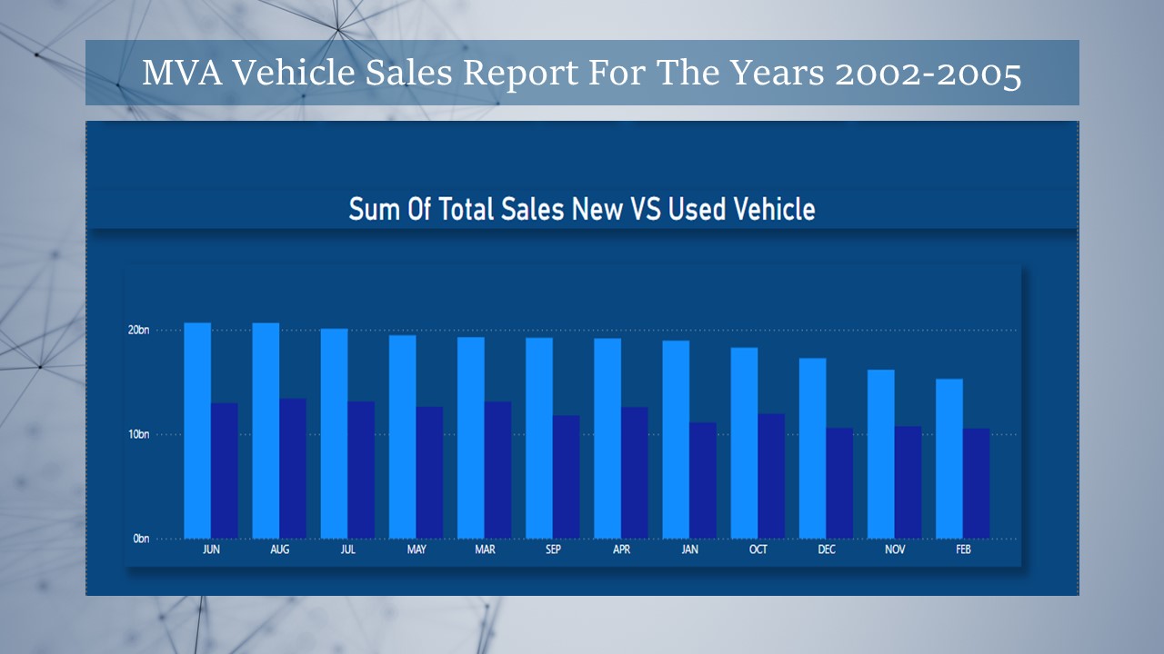
The bar chart detailing
The bar chart detailing the monthly sums of used and new vehicle sales provides a dynamic and granular perspective on the fluctuations within the automotive market throughout the year. Each bar represents the total sales volume for a specific month, distinguishing between used and new vehicles. This visual presentation allows for a month-by-month comparison, facilitating the identification of seasonal trends or variations in consumer preferences.
Stakeholders can easily discern whether certain months exhibit a surge in new car purchases, while others may see a higher demand for used vehicles. The bar chart serves as a valuable analytical tool, enabling decision-makers to pinpoint temporal patterns and make informed strategic decisions based on the nuanced sales dynamics observed over the course of the months.
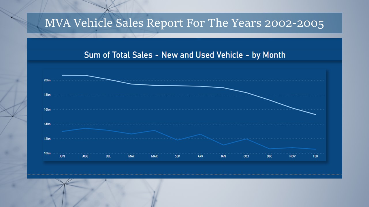
The line chart
The line chart illustrating the month-over-month comparison of the sum of used and new vehicle sales provides a dynamic and continuous narrative of the market trends. Each line on the chart represents the cumulative sales of either used or new vehicles across the different months. This visual depiction enables a fluid observation of the overall trajectory, highlighting trends such as ascending patterns denoting growth or descending lines indicating fluctuations. The month-by-month comparison in a line chart offers a nuanced understanding of the temporal evolution of used and new vehicle sales, empowering decision-makers to discern long-term patterns and make strategic adjustments in response to market dynamics.
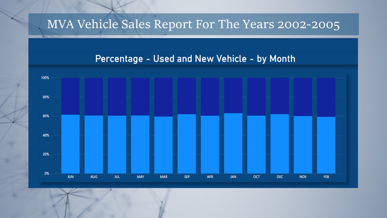
The stacked chart
The stacked chart showcasing the percentage distribution between new and used vehicle sales provides a visually compelling representation of market composition. In this graphic display, each segment of the stacked chart represents the proportion of total sales attributed to either new or used vehicles. The cumulative height of the segments reflects the overall sales volume, while the distinct colors help distinguish between the two categories. This visualization not only offers a snapshot of the market share held by new and used vehicles but also allows for a clear comparison of their proportional contributions.
The stacked chart serves as a powerful tool for stakeholders, enabling them to grasp the relative significance of each segment within the entire sales landscape, fostering a deeper understanding of consumer preferences and market dynamics over time.
Data Source: https://catalog.data.gov/
Project By: Humaira Talha
Tools Used: Power BI, Power Point, Chat GPT and MS Excel.
Disclaimer: The data presented herein is provided for informational purposes only, and no responsibility or liability is accepted for the accuracy, completeness, or suitability of the information. Any reliance placed on this data is at your own risk. We make no representations or warranties, express or implied, regarding the data’s reliability or fitness for a particular purpose. Furthermore, we disclaim any responsibility for any direct, indirect, or consequential damages that may result from the use or interpretation of this data. Users are advised to independently verify and validate the information for their specific needs and circumstances. This disclaimer applies to all aspects of the data presented, including but not limited to its accuracy, timeliness, and relevance.